Client
Music Sales/Omnibus Press
Music Sales/Omnibus Press
The company arranged an impressive music event and book launch at Foyle’s Charing Cross Road Branch with over 100 copies sold on the day.
The Production Manager for Omnibus Press also entered it into the book production category of the 2018 British Book Awards.
My Input: Cover & Editorial Design, Art Direction, Photography
Author: Julian Joesph
Editors: Sam Lung, James Welland
Paintings & Collages: Polly Rockberger
Hand Lettering: Raissa Pardini & Parastou Khiaban
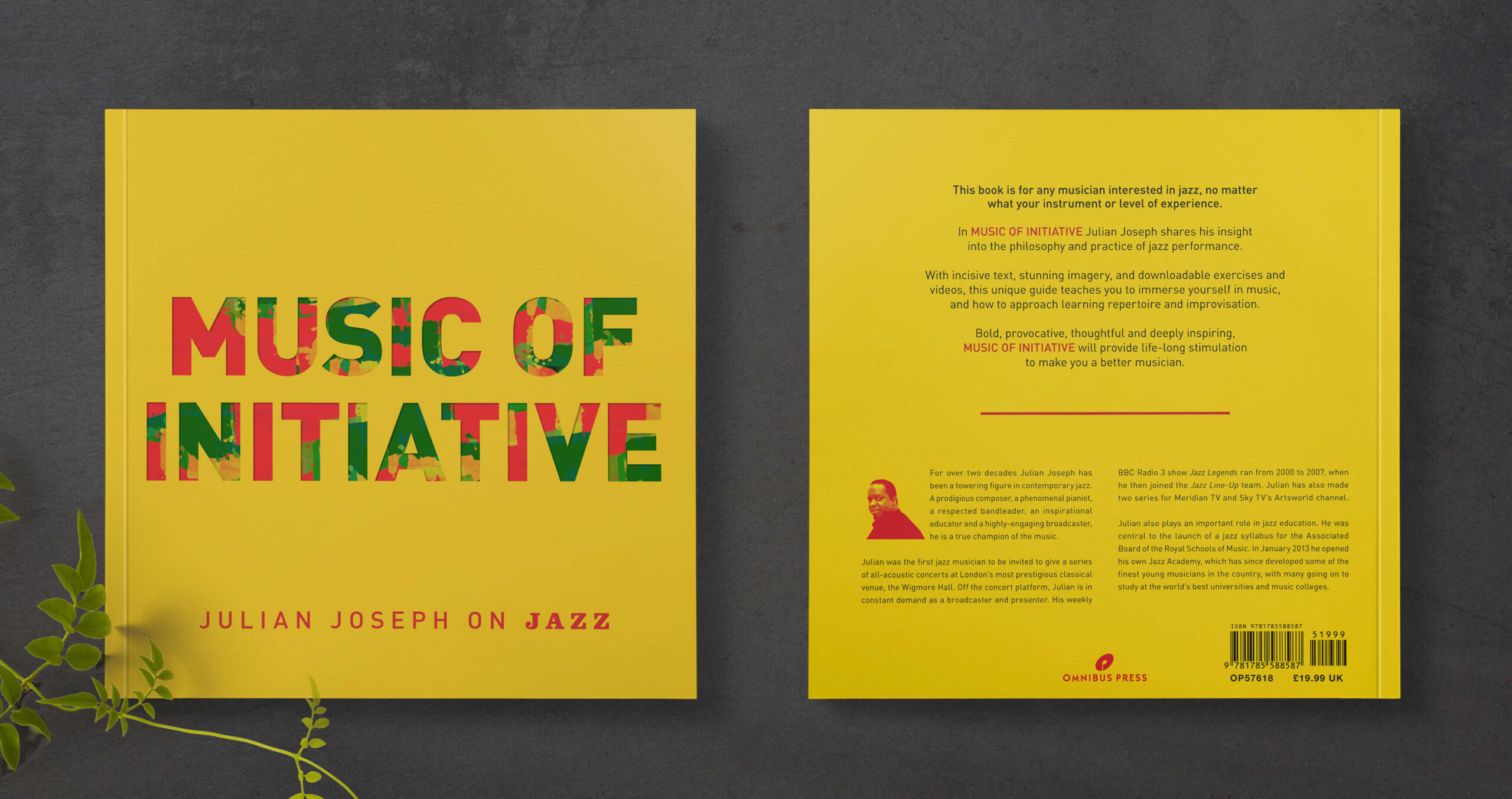
I remember when I had the opportunity to design a reference book on Jazz while working at Music Sales. It was such a unique and exciting project because we wanted to make it accessible to music students of all levels and to the lay reader. I had the freedom to think outside the box and use an unconventional layout that would capture the essence of Jazz in a fresh and artistic way.
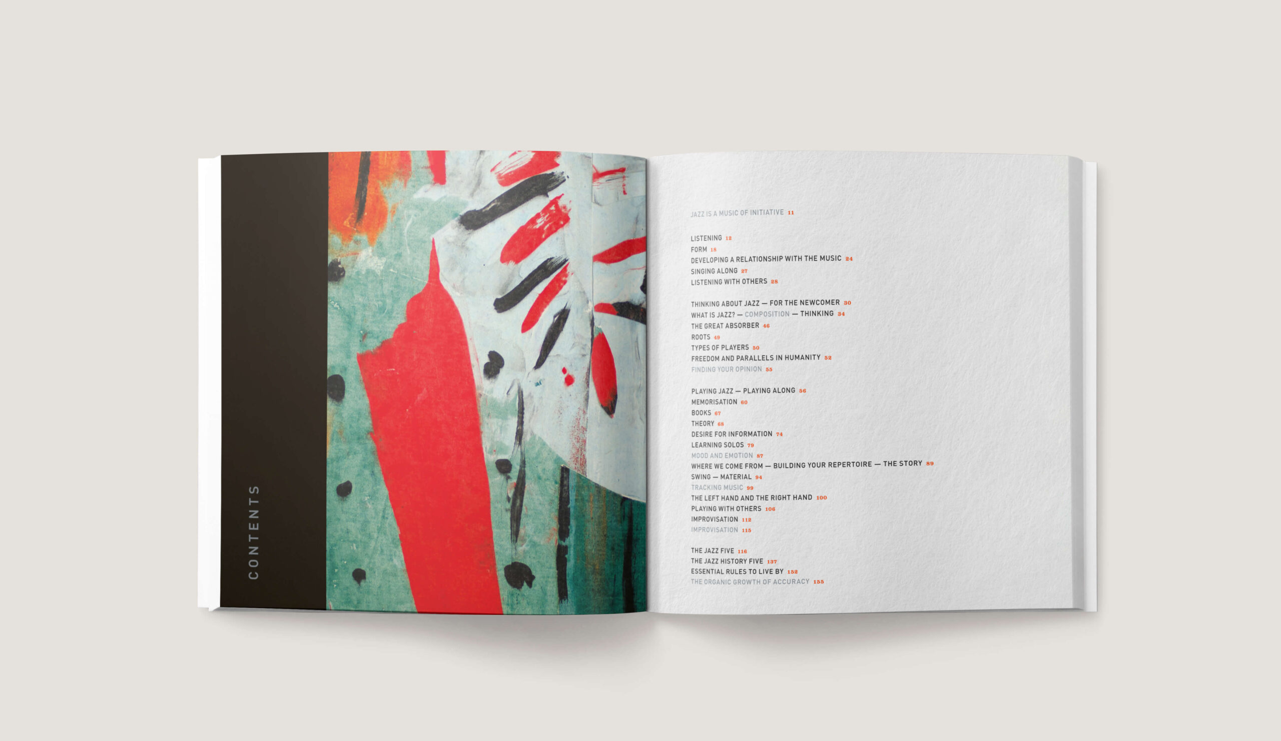
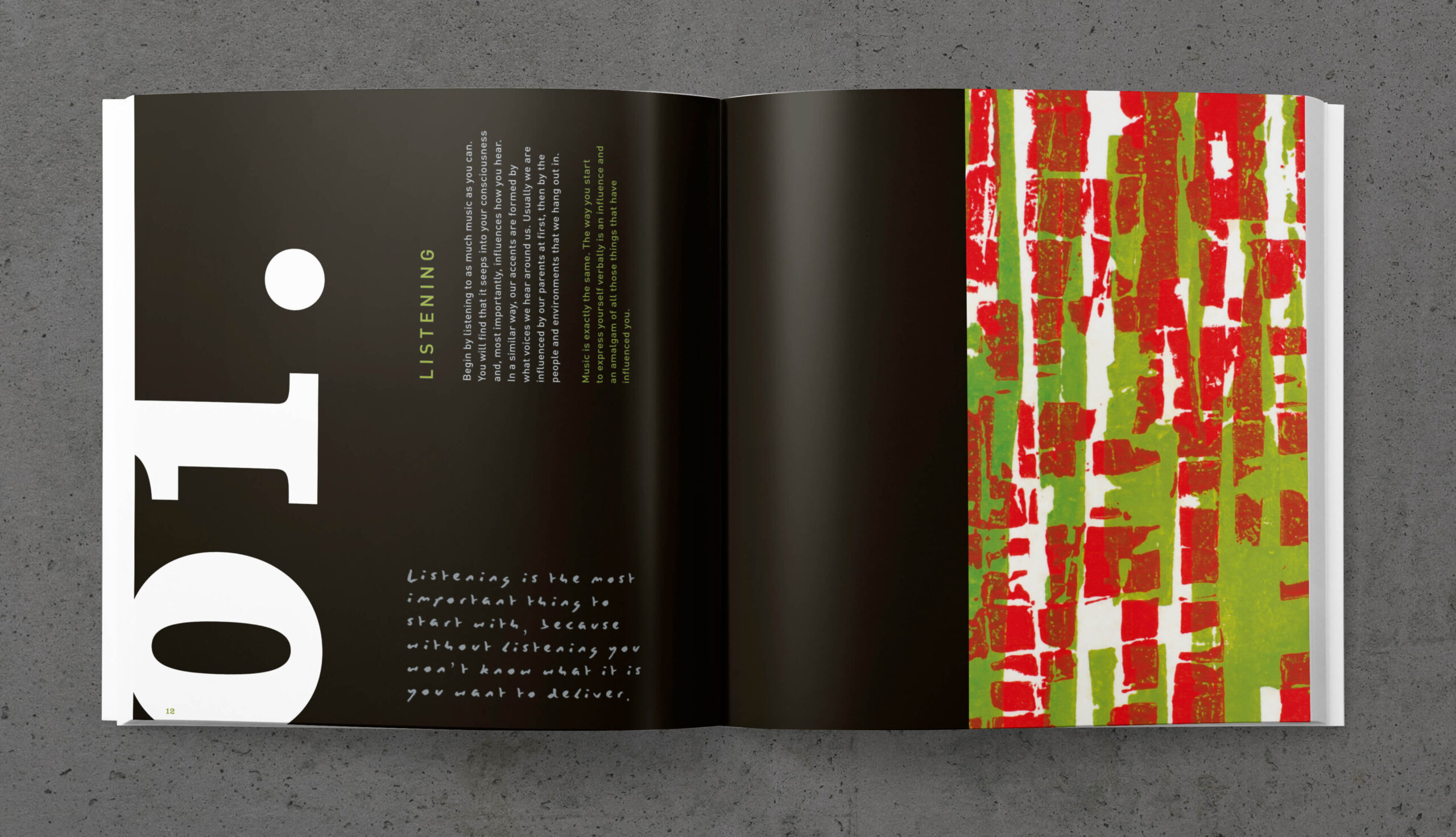
To achieve this, I designed a colorful 160-page paperback book using uncoated paper stock, which gave it an organic and natural feel. I utilised a variety of imagery and alternative grid layouts to capture the flow and enable readers to dip in and out of the book at their leisure.

I utilised my photography skills to capture background textures and elements that I could later use in the book. I also got creative by using the scanner to create abstract patterns and computer glitch screen grabs, which added more character and depth to the design.
One of the biggest inspirations for the project was Alan Fletcher’s ‘The Art of Looking Sideways,’ which has a very free and creative non-linear style. I incorporated this approach by adding hand-lettered quotes throughout the book to bring a personal touch.
The font pairing was chosen based on their bold curves and clean, assertive feel, with Clarendon black for the numbers, and Din Pro for the headers and body text. The colors were also carefully selected to give warmth and bring out the artwork.


Overall, working on the project was a fun and exciting adventure. It was a collaborative effort that allowed me to be creative and resourceful within the time restraints. Although I would style one or two spreads differently, I am very pleased with the end result.
“
I approached Ruth for some freelance help with my own website. When our collaboration led on to the commission for Music of Initiative’, I had an opportunity to see Ruth’s process as a book designer. I loved the way she ‘played’ with some of my paintings, crafting unexpected ways to use them in the service of the text. Her choice of paper, font, colour, were in my view impeccable, and she unhesitatingly did all the necessary photography of my work.
The author was certainly delighted; at the launch he made a point of complimenting Ruth’s vision for the book and the job she did.
It’s rare that one designer can trust another to do justice to her work, and I regard myself as very lucky to have had Ruth in my corner.
Polly Rockberger