Client
Joe Acheson, Hidden Orchestra
Joe Acheson, Hidden Orchestra
Within two months of the album release, the CD album stock had sold out, and 70% of the vinyl album stock had also been sold.
My Input: Creative artworker for the Vinyl & CD Album & digital singles
Artwork by: Norman Ackroyd
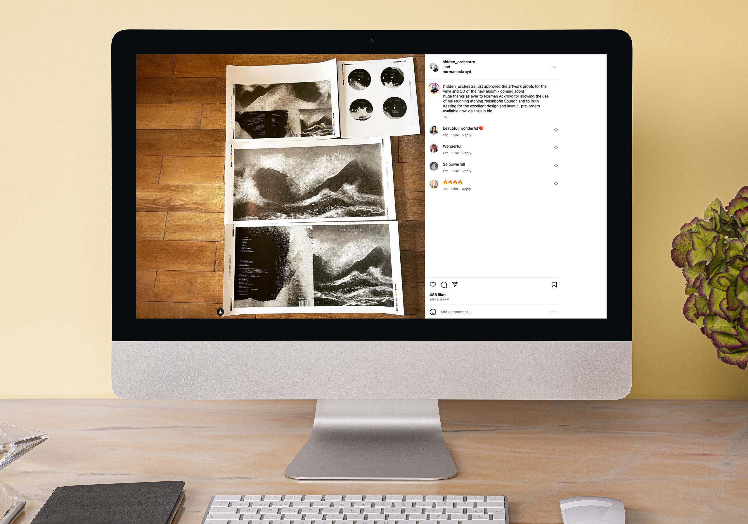
I had the pleasure of collaborating with musician Joe Acheson from Hidden Orchestra on the design of his latest album. This involved creating designs for a double LP and CD release, due to hit the shelves before his upcoming tour.
Joe provided a preliminary cover design featuring an etching by artist Norman Ackroyd, along with his second artwork for the inside cover spread and additional design elements. The goal was to maintain consistency with the style of his previous album while integrating diverse design components.
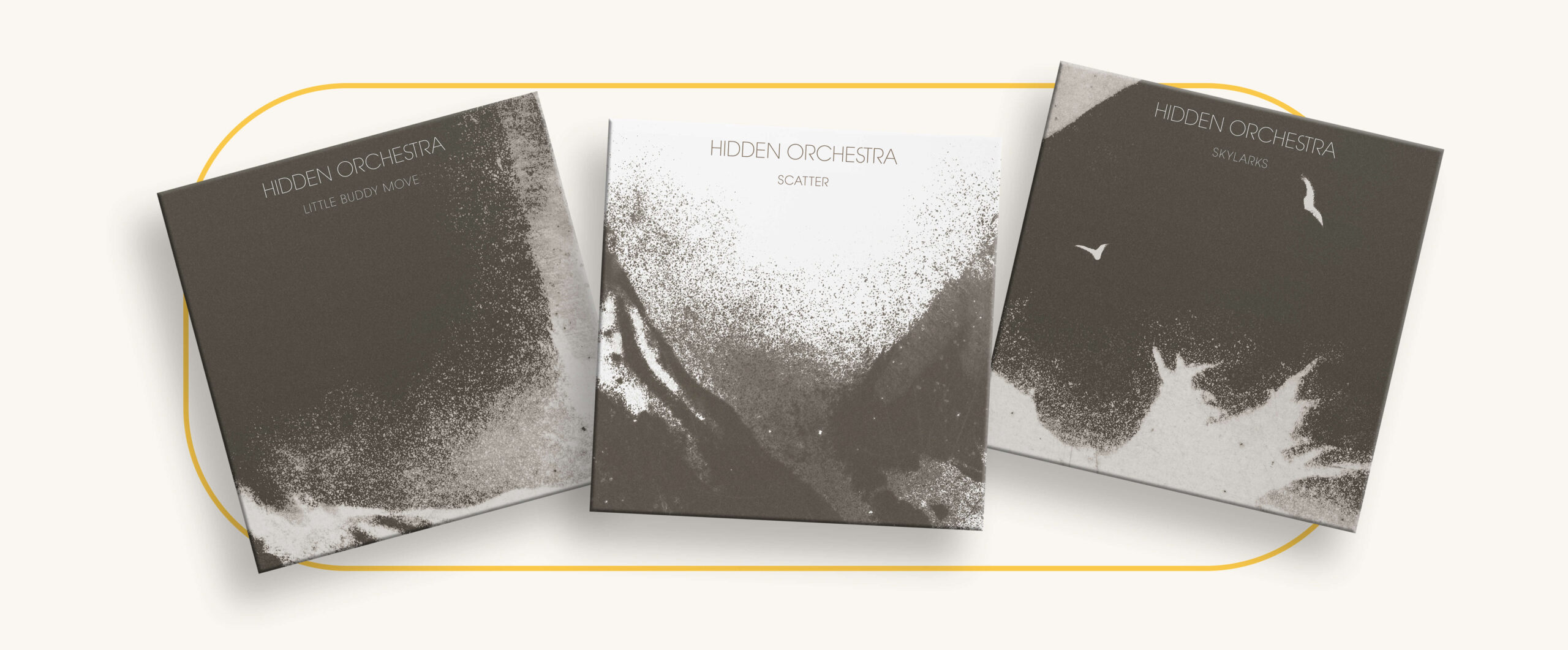
Avant Garde was the font of choice which matched his previous albums and the Hidden Orchestra logo. A vectorised version of the logo was created to ensure crisp clean lines.
Joe provided a logo to mark his debut album under his new imprint, ‘Lone Figures’. This needed to be redesigned after I discovered that it was not possible to license the Sans-Forgetica font used in the logo. For a clean and more simplified look, Proxima Nova was chosen, without a drop shadow or being in italics. Fewer sections were cut to emphasize the horizontal lines and to give the logo more flow.

Acknowledging concerns about colour consistency, potential variations were mitigated by employing proper colour management processes and recommending a chromalin proof.
To complement the textured front cover, a textured paper grain was subtly added throughout the design.

By inverting or zooming in to distinct areas, related yet unique images were created. Font sizes were significantly increased for online legibility.
From the printer’s templates, the designs were adapted for the specified dimensions, maintaining a consistent look across both formats.
Halfway through his tour, Joe requested for a 28-page booklet to be designed. It was to contain background information on his tracks and to be bundled with the remaining stock. With a limited budget, the cover was printed in colour with greyscale pages throughout. Leveraging the inverted single design and employing a simple grid structure, the booklet seamlessly complemented the album, enhancing the overall package.
Despite the tight schedule, all elements were printed and pressed on time for his tour. Joe was really happy with the final results.
I enjoyed working on this project not only because Joe and Mirza were genuinely lovely people to work with but also because I liked Hidden Orchestra’s aesthetics. Additionally, being able to listen to beautiful contemplative music while working on it made the experience even more enjoyable. The project was a perfect example of successful collaboration and clear communication.
“
Ruth helped me to put together all the artwork for the first Hidden Orchestra album released on my own label.Not only was the design work excellent and quick, it was meticulous and creative.This kind of enthusiastic praise can sound insincere, but whenever I work with people who show generosity and competence alongside their talent, I believe it’s worth letting other people know that this is someone worth hanging on to.Joe Acheson