Client
Sketches & Pause:
Pretty Decent Records, Poppy Ackroyd
Pause Reworked,
Pause Reimagined:
Poppy Ackroyd
Sketches & Pause:
Pretty Decent Records, Poppy Ackroyd
Pause Reworked,
Pause Reimagined:
Poppy Ackroyd
Following two highly successful collaborations with composer and musician Poppy in designing her two sheet music books, she entrusted me with designing the cover and individual singles for her latest EP, ‘Pause Reworked’ and ‘Pause Reimagined.’
My Input: Cover & Editorial Design
Artist: Norman Ackroyd
Editor for Sketches: Sam Lung, Pretty Decent Records

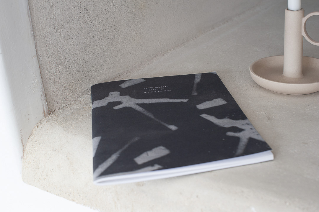
Contemporary classical composer, Poppy Ackroyd wanted her first book of piano compositions to be published alongside her album launch. I was approached by Pretty Decent Records to design the book. Overall, the look and feel was to have a minimal contemporary feel, similar to her beautiful compositions.
The brief was to use the same artwork and typeface from her album but there was flexibility in the placement. The back cover art was flipped to enhance the striking pattern. I added a very fine black outline to the thin typeface to ensure the heavy linkage didn’t seep into the type. The cover was printed on uncoated stock.
For the internal pages I made generous use of the white space. I chose the typeface nobel for the body text which has a very modern and simple feel.
After a positive outcome from her first book, Poppy wanted to publish her new collection of compositions in a second book. The book was to compliment the style and tone of the first book.
She supplied four sketches for me to choose one to create a cover from. I chose the image of piano keys for the front cover with a contrasting back cover using a sketch that was reversed out.
To keep the look and feel consistent, the same typeface was used as the first book. I also laid out the internal pages in a similar manner, using a lot of white space to create a feeling of calm contemplation.
Poppy reached out to me for my design skills to develop artwork for her two latest EP releases, Pause Reworked and Pause Reimagined. For both, she was interested in designs that were unique yet retained a visual link to the original Pause cover.
For Pause Reworked, the Pause artwork was inverted to create a dark version that contrasted well with the original cover.
For Pause Reimagined, I combined the Pause and Pause Reworked designs to create a split image of two halves merging subtly in the middle. The result was a cover design that maintained harmony and offered an interesting twist.