Client
Laila Mackenzie & Ian Snowball
Laila Mackenzie & Ian Snowball
The first print run nearly sold out in one year. The book featured in:
V&A Dundee’s exhibition, Night Fever: Designing Club Culture.
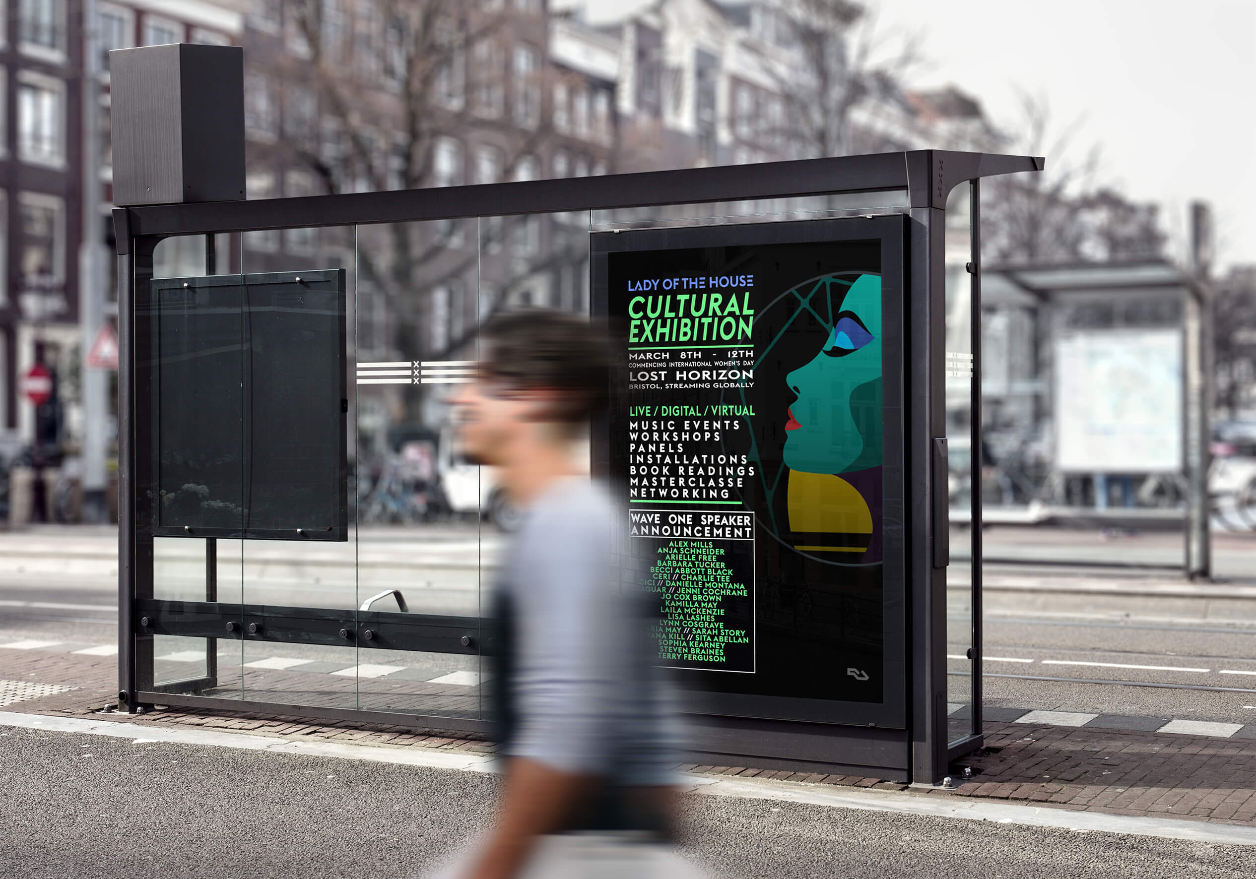
Lady of the House 3 day Cultural exhibition event in Bristol.
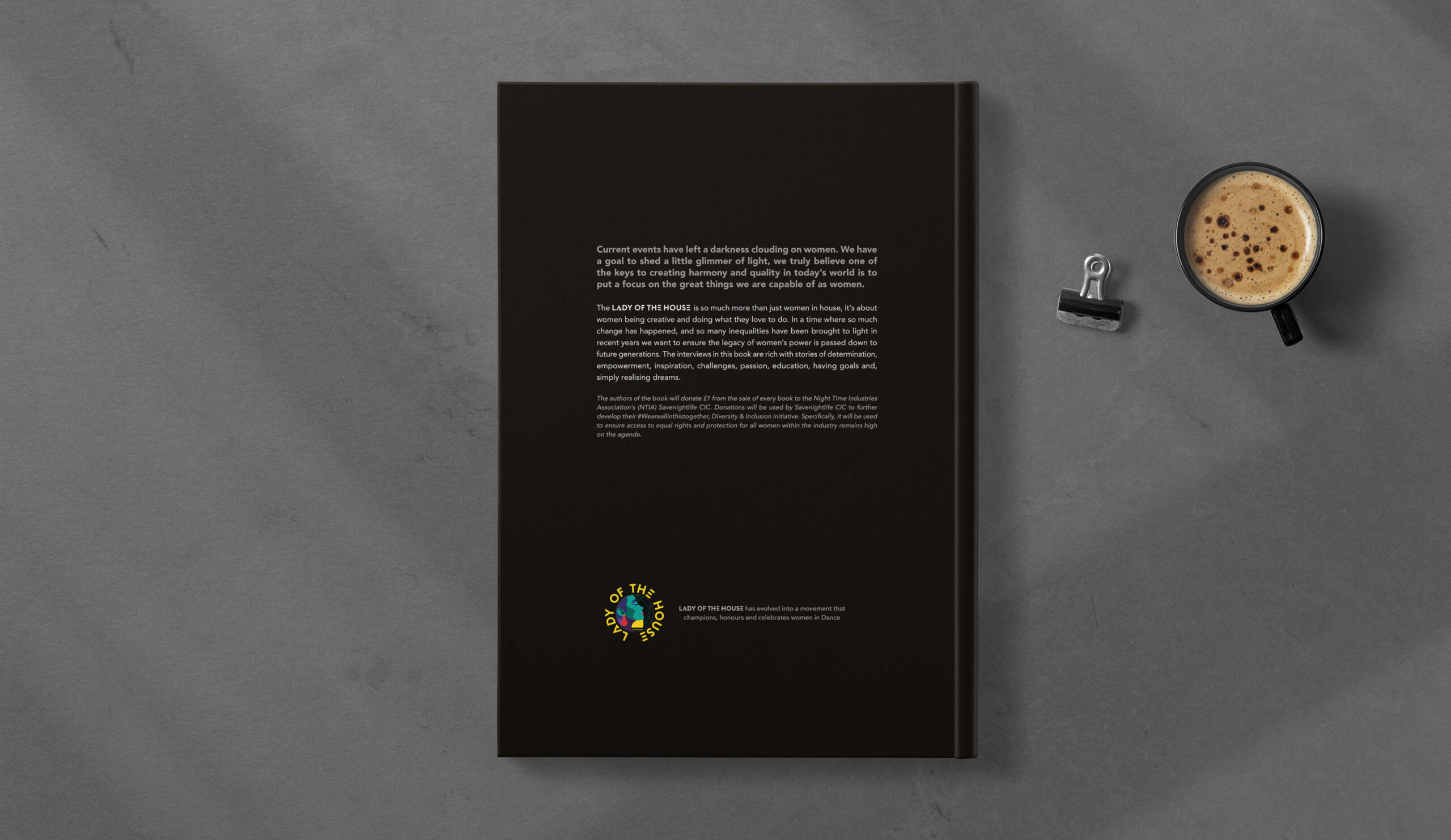
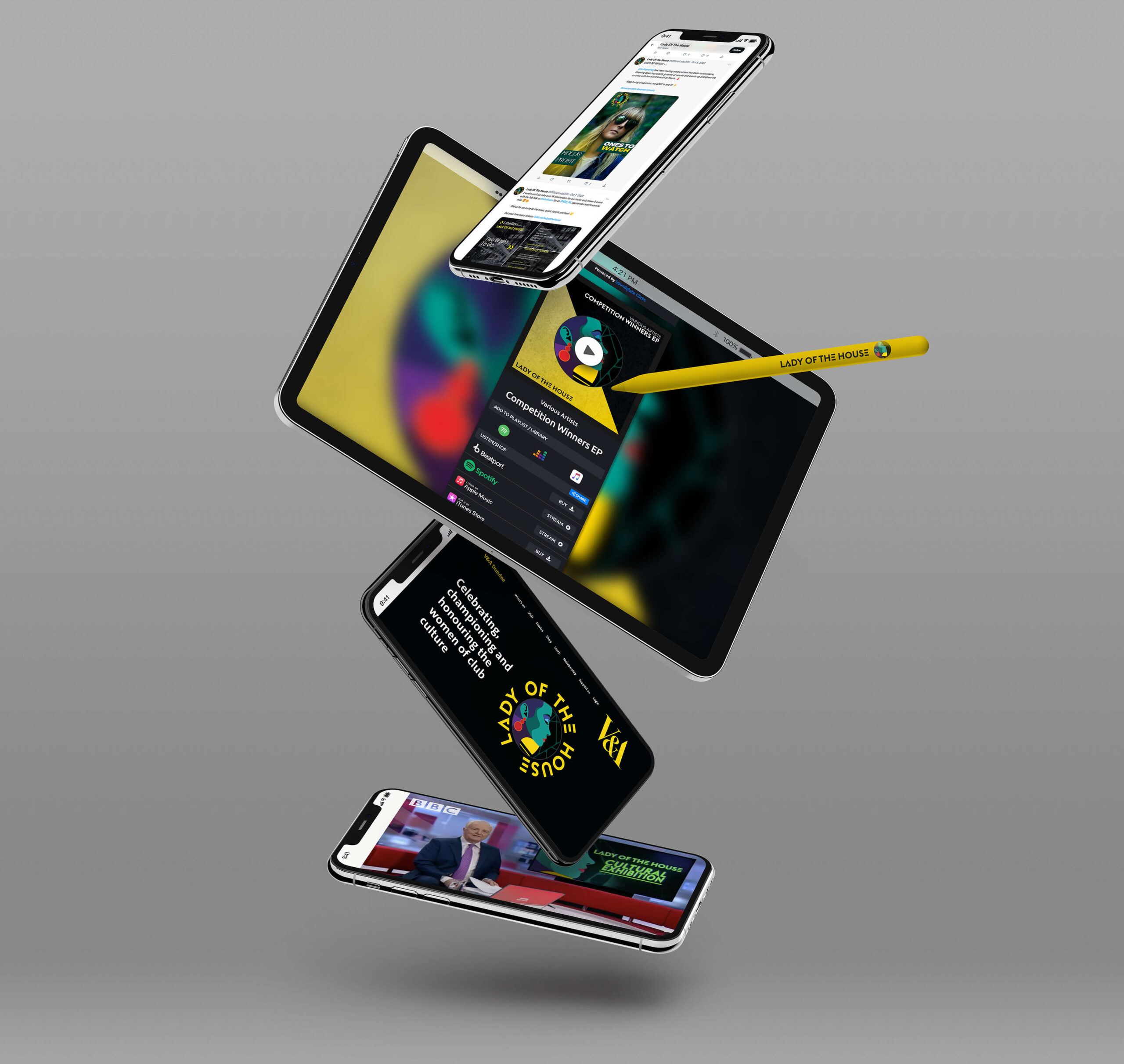
The Logo has been used for the movement’s marketing collateral and for their new music label. The Lady of the House movement was shortlisted for the BBC Radio 1 2021 Dance Impact Award.
My Input: Cover & Editorial Design, Art Direction, Logo Design & Illustration, Retouching
Author: Laila Mackenzie, Ian Snowball, 100+ artists
Music events manager, Laila Mackenzie and author Ian ‘Snowy’ Snowball joined forces to co-author a coffee table book. The book was to celebrate female/non-binary artists, who have been underrepresented in the music industry for too long. It was also to mark the start of a new movement. They approached me to design the book in a freelance capacity. The book was already in high demand thanks to a successful crowdfunding campaign, so meeting the tight deadline was a must.
I designed two hardback books—a standard version and an exclusive signed limited edition. By using strong visual contrasts to reflect current design trends, I was also able to reinforce an aspirational message of strength and positivity. I chose a neat geometric typeface for a timeless professional look. Despite some last-minute changes, the book met its deadline. I also designed the logo for the Lady of the House movement.
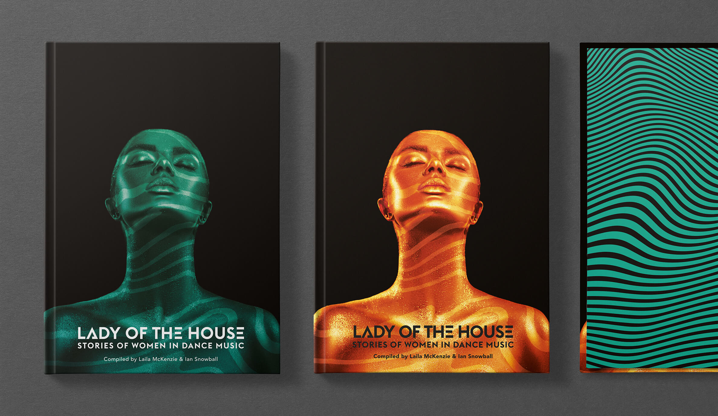
It wasn’t always smooth sailing, though. At first, both authors had different views on the cover design – one wanted a photo, while the other wanted an illustration. Thankfully, we came to a compromise with the photographic design chosen for the cover, while I worked on the illustrated design further to become the logo for the Lady of the House movement.
I modified a stock image of an androgynous woman by overlaying a light pattern, as a nod to the club scene. By placing the title towards the bottom, I was able to give the image more strength and dominance. To disguise the skin tone, I changed the dominant colour and created two options; a vibrant orange, and turquoise-green.
For the illustrated design option, I drew the profile of a woman from a stock photograph. I also took inspiration from old Vogue magazine illustrations and also from current club flyers that Laila liked to come up with a vibrant and captivating image that’s sure to catch your eye.
But it wasn’t just the cover that I worked on – I also had to figure out the internal layout. To help stay within the budget, the printer asked if the page extent could be kept to 200 pages. With over 100 artists featured in the book, it was important to keep the text concise while maintaining a good design flow. After thorough research, I chose the Avenir font, which is both friendly and compact enough to fit a maximum of two pages per artist.
For the title header, I found Euclid, a modern and geometric typeface. I chose a variant of the E, which looks like an equals sign and resonated with the traits of the genre.
The book turned out so well that the authors decided to create not one, but two editions. The standard book features a stunning turquoise-green colour, while the exclusive signed edition features a fiery orange cover. We had to keep within budget, of course, but that didn’t stop us from adding a touch of luxury with copper foil-stamped text on the spine, copper metallic endpapers, orange head/tail ends, and matching ribbon.
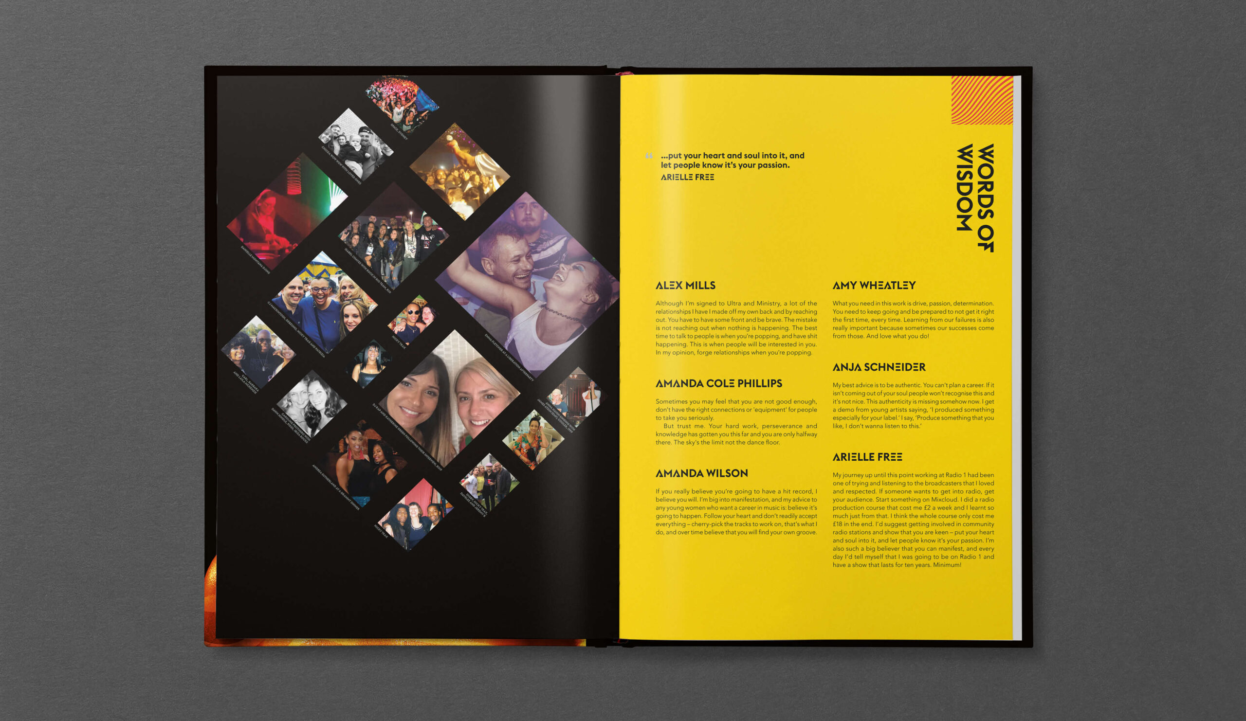
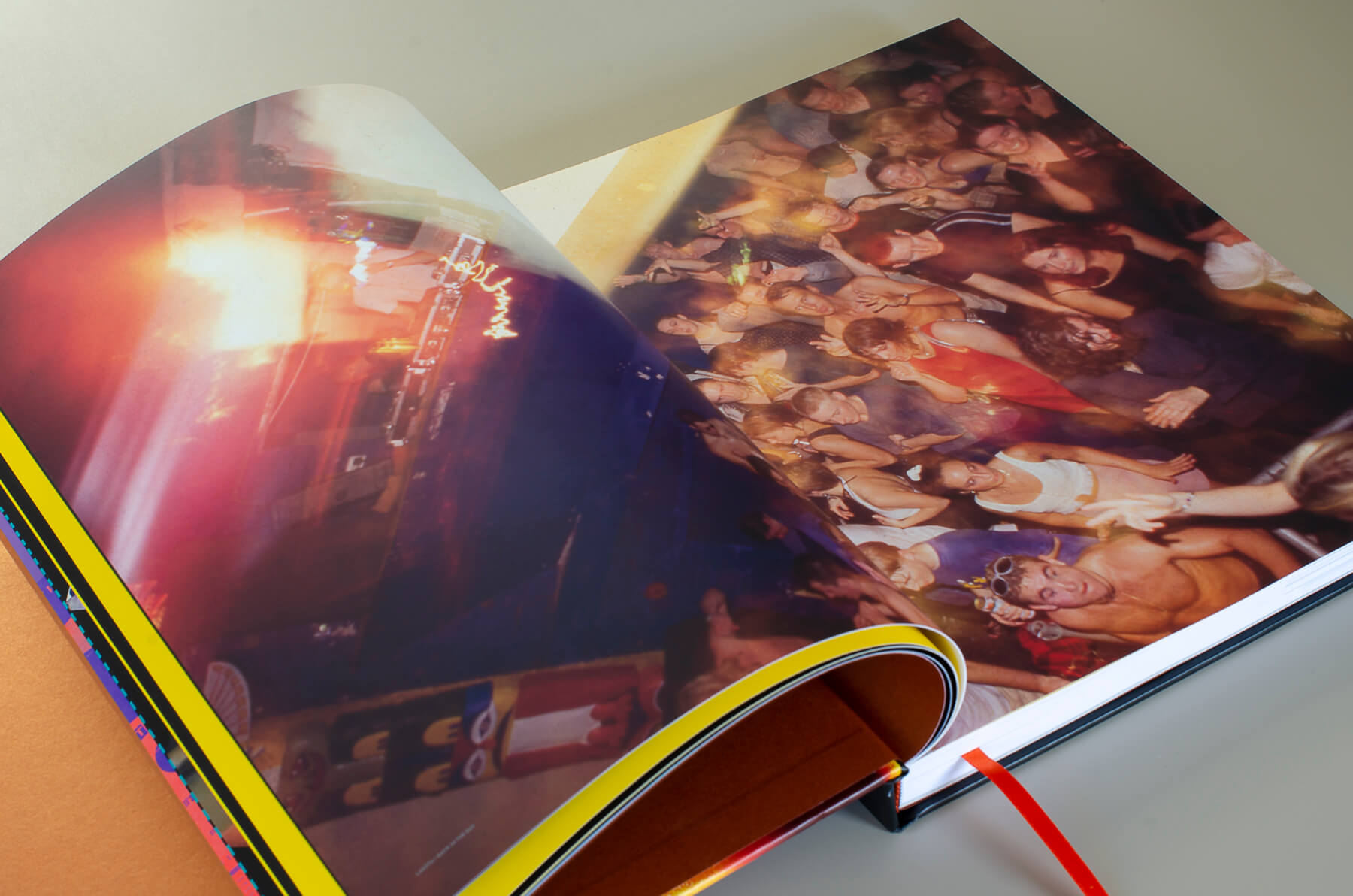
I made sure that every artist showcased their best selves by balancing out any variation in image quality and properly crediting the photographers.
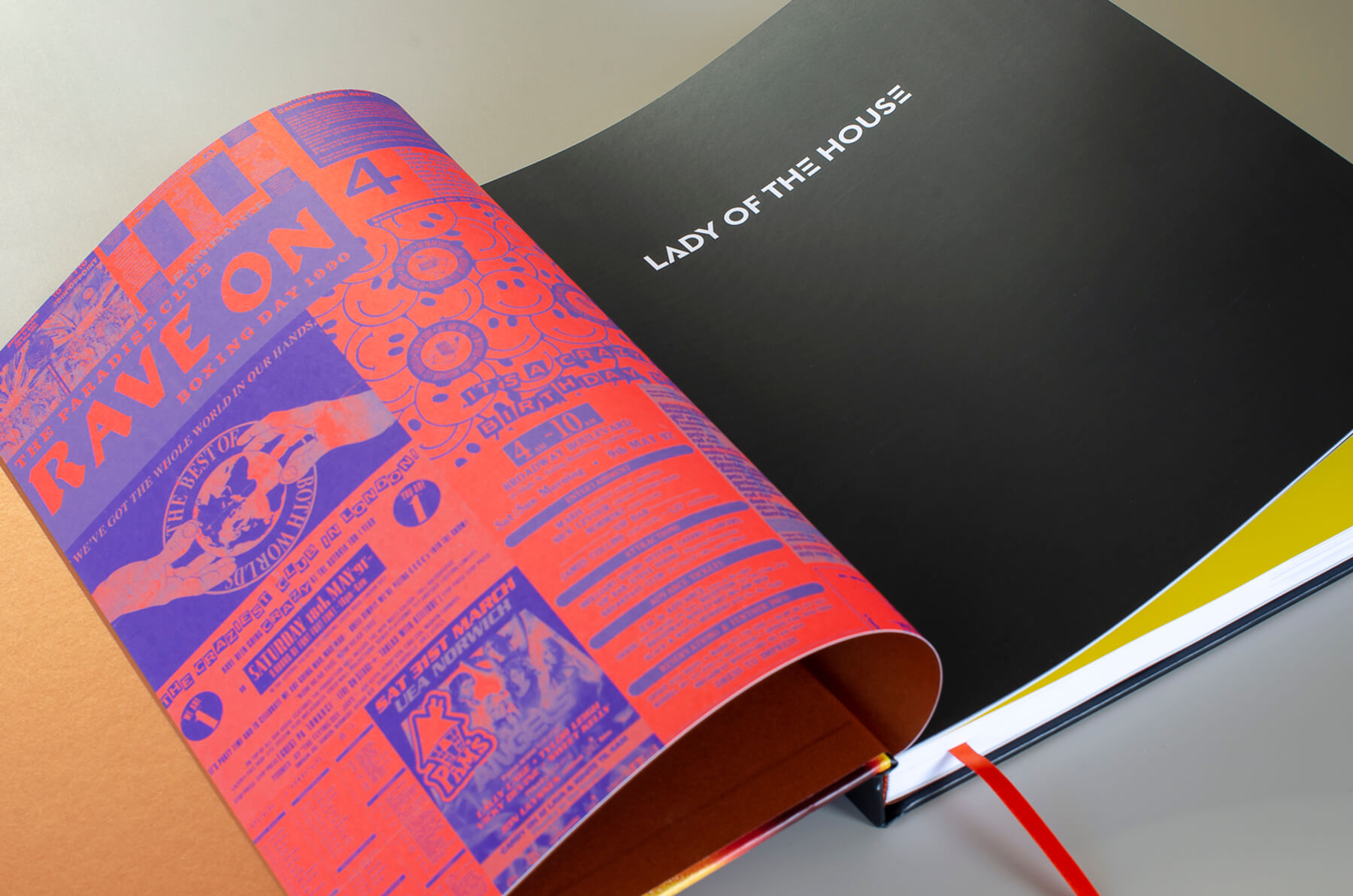
The artists featured in the book supplied old music flyers along with their photographs. To make a feature of these, I compiled these to use as endpapers. The flyers varied in style from black and white type-only designs to ones that were very polished. For a more unified look, I created a patch-work layout in a two-tone colour. To add texture and vibrancy, I chose for the endpapers printed on uncoated paper using vibrant spot colours.
All in all, this project was an incredible journey. It was an honour to work with Laila, Snowy as well as such talented artists and create a gem of a book that celebrates diversity and inclusivity in the music industry.
“
Ruth worked on a particular book project that required a special sensitivity and empathy, and she approached the project professionally and as if by magic just seemed to know what the book and the authors needed. No task was too hard or difficult for her, and everything was presented to us in an open and creative way, which made working with Ruth a pleasure, and I certainly intend to work with her again in the future.
Ian ‘Snowy’ Snowball
